Prototyping, design and build of a content-managed portfolio and online shop for Malika Favre, a renowned artist and illustrator. A website that has stood the test of time and is coming close to it's tenth anniversary of being online.
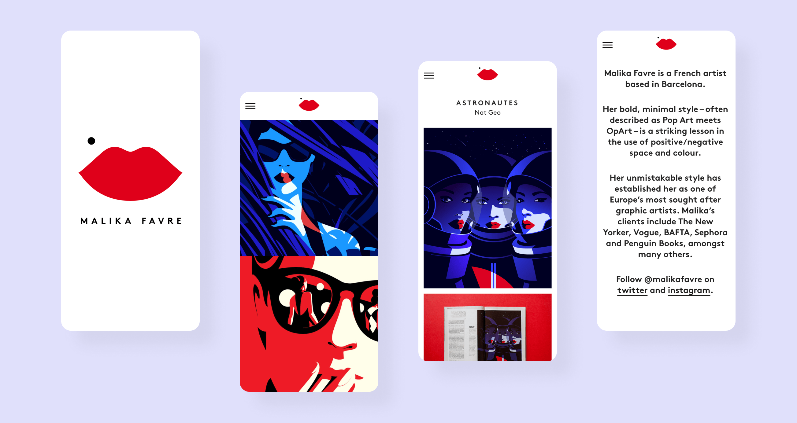
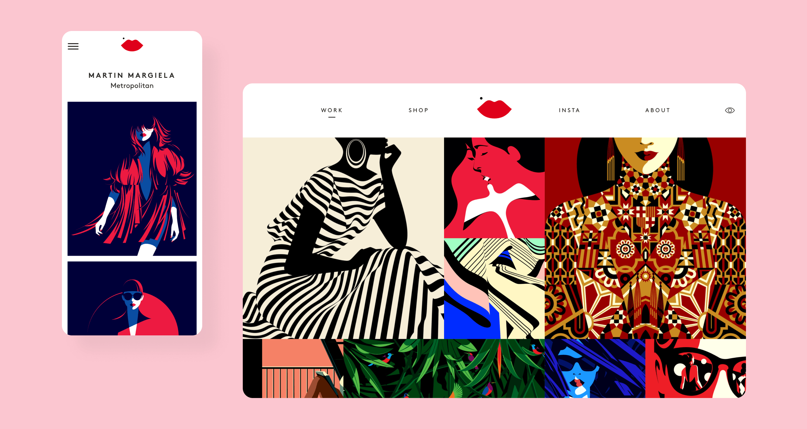
Over the summer of 2015, I designed and built a new online portfolio and shop for illustrator and graphic artist Malika Favre. Normally I would just show pictures of the outcomes of my work as I have above. But I’ve realised this can be a bit meaningless without the context of how I got there. As an experiment I thought I’d document the process with a view to maybe always doing it in the future.
Process
Having worked together before, Malika and I have a good collaborative working process. We both like to share ideas often, iterating and adapting as we go so we can stay open to new possibilities.
Initially we chatted in detail about the kind of thing she wanted to create. The site needed to be simple and confident in both presentation and interaction. It should be image-led as a means to let her work speak for itself. We also wanted to integrate Malika’s online shop and set things up so she would be able to update pretty much all aspects of the site herself.
I like to design around real data when making sites and am keen to solve the big design problems as early as possible — especially the technical ones. So, we agreed that it would be a good idea for me to spend a few days at the start of the project prototyping some ideas in the browser, playing with layout and interactions to see where it might lead. This would allow us to get to a strong solution fast.
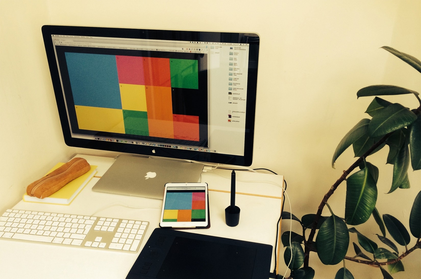
Prototyping layouts and interactions in the browser, helps me catch and share problems early.
Prototyping
I did a bit of sketching on paper and then began playing around positioning containers (as placeholders for projects) in a layout based on the golden ratio. Malika uses this to underpin a lot of her illustration work. But this turned out to be a bit too restrictive and imposed too much arbitrary hierarchy.
In a second prototype I kept the square containers but removed the varying scale, instead only showing one larger item with the idea that it could maybe be a ‘featured’ project. We both liked this direction. It felt in keeping with Malika’s work. Squares have an inherent simplicity that works well with the web where vertical size and positioning can be hard to determine and control. This would give us flexibility and remove complications for Malika when making images.
The focus of the third sketch in code was to try to solve how the layout would respond at different screen sizes with a mix of different sized media. Isotope proved to be a useful code library to this end and allowed me to make an index of projects that reflow to suit the device they’re viewed on.
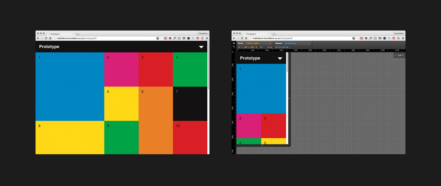
Adapting the layout for different screen/device sizes using browser dev tools.
Animated transitions
In the next prototype, I also introduced the idea of transitioning to a project rather than the usual full page reload — I like how the movement is more graceful when moving between the index and projects. We were both happy with how this was progressing. Then Malika had the brainwave to suggest that the transitions should come in from a given thumbnail’s nearest browser edge. I wasn’t sure initially how best to do this but took it as a challenge as I knew it would feel better from an interaction point of view.
I started out thinking I’d need to break the screen into ‘sectors’ and then check which sector a thumbnail is in before triggering the animation. This was unnecessary though. Ultimately the solution was simple. It was just about calculating the x and y position of the cursor relative to the viewport’s width and height and going from there. Kinda obvious with hindsight.
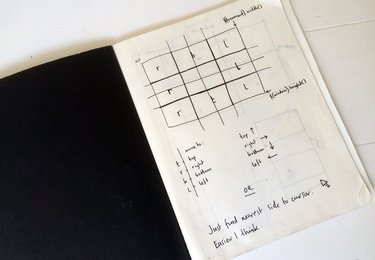
Working out how to ensure projects transition in from the browser edge nearest the cursor.
I made further prototypes and by the time I had produced this one introducing filtering, we had a pretty clear idea of how the site should behave. From there it was a question of adding fidelity and detail as we went. Linking the template up to the CMS was also useful, meaning I could work with proper data, designing around real content like project titles, descriptions and media.
Typography
We tried out a number of webfonts including Harmonia Sans, Aperçu and Verlag, before settling on Brown by Lineto. We wanted something with clear, simple lines that mirrored Malika’s artwork. All fonts were demoed in situ in a browser so we could accurately see how they rendered and I could adjust the letter spacing and line heights accordingly. You just don’t get an entirely accurate translation from things like Figma to web.
Iconography
The icon set evolved as the project progressed with us both trying things out. It was ultimately finessed when the type went in — we drew the final set seen below where the weight of the lines nicely complements the typeface and the set is simple and unified.

Iconography used across the site, which I redrew for different displays and screen densities.
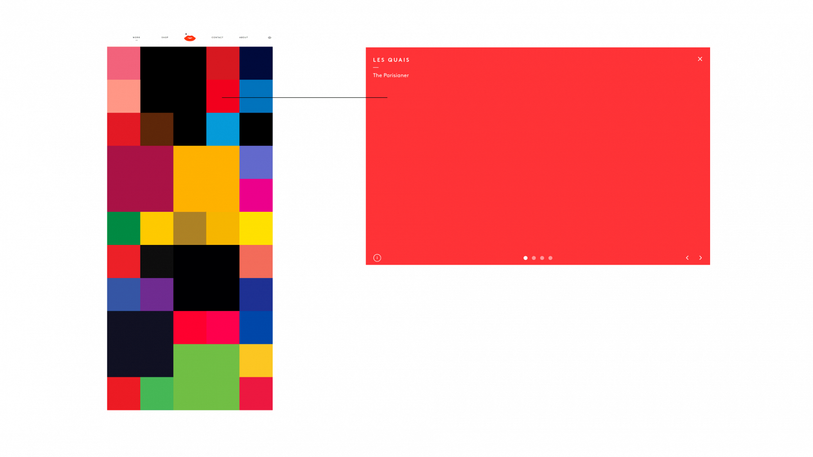
The hover colour in the index view is also used as the background colour in the project view. This gives a more seamless animation transition between views.
Colour
We both really care about colour and favour bold, bright palettes. But no one knows Malika’s work better than she does, so I wanted to make a mechanism where she could create palettes for her projects. This is controlled via the CMS — she can specify rollover/background colours and borders on a per project basis. Every project’s rollover colour is mirrored in it’s background (as shown above) and we get a nice transition effect when moving between the two.
Images and videos
All media can be edited and updated through the CMS and a great deal of the work on the site was in ensuring that media displays appropriately across different devices and viewports. Project images are shown in carousels on the desktop for example. These carousels work with touch events on an iPad, but on a mobile phone you will instead see a vertical stream of images. The aim being to make the site easy and elegant to use on different devices.
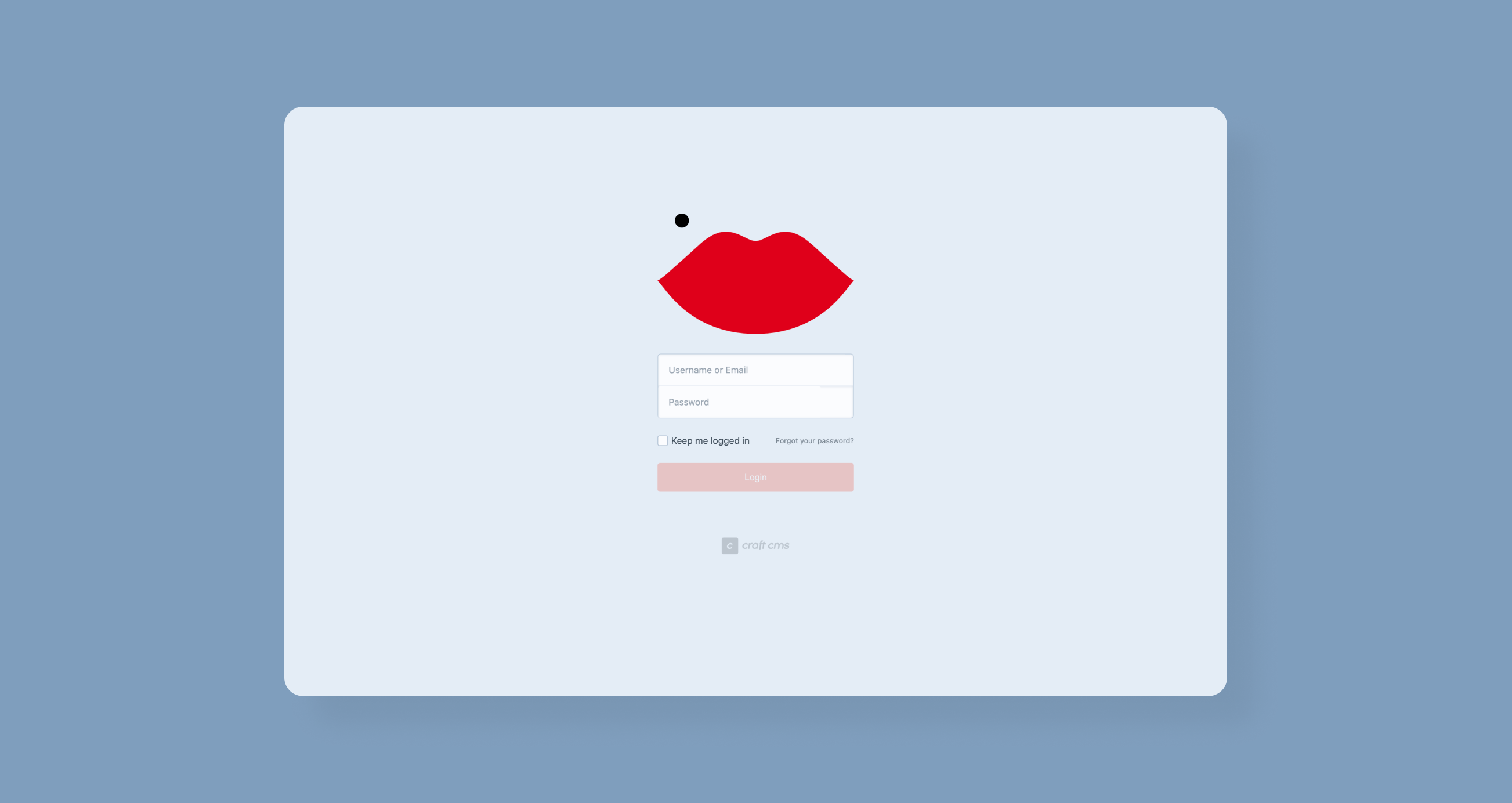
The site runs off Craft CMS, my preferred content management system.
Credits
Design by Guy Moorhouse × Malika Favre.
Front and backend development by Guy Moorhouse.
All content copyright Malika Favre.
2015–Present.
