Freelance product design, illustration and prototyping for the Government Digital Service. I was there in the very early days, helping to take GOV.UK from a working prototype through to a live, canonical service, and beyond.
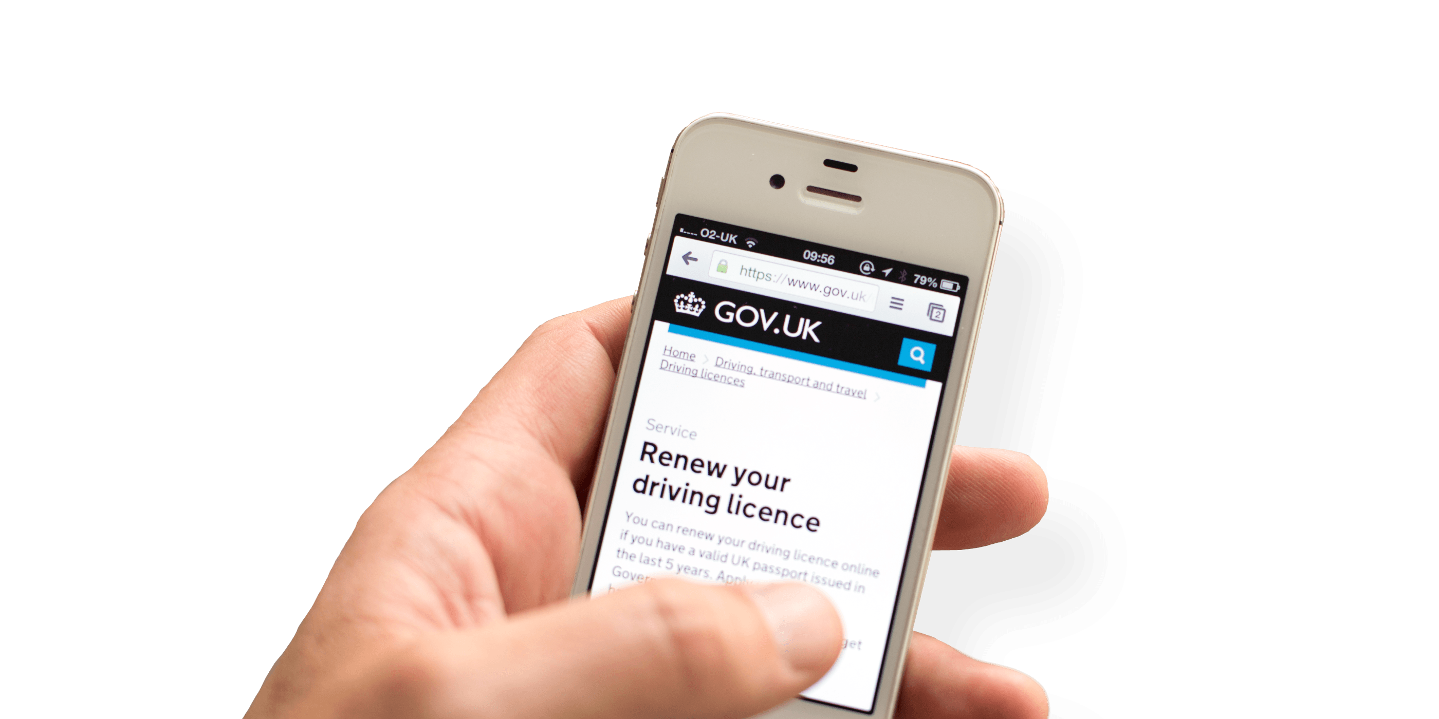
I worked as a freelance senior designer from 2012–2015 at the Government Digital Service, joining just after it’s inception. As one of the founding designers, a big part of the work I did was helping to take GOV.UK from a working prototype through to a live, canonical service.
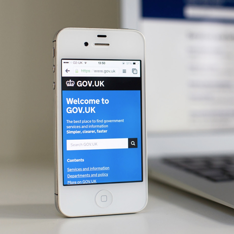
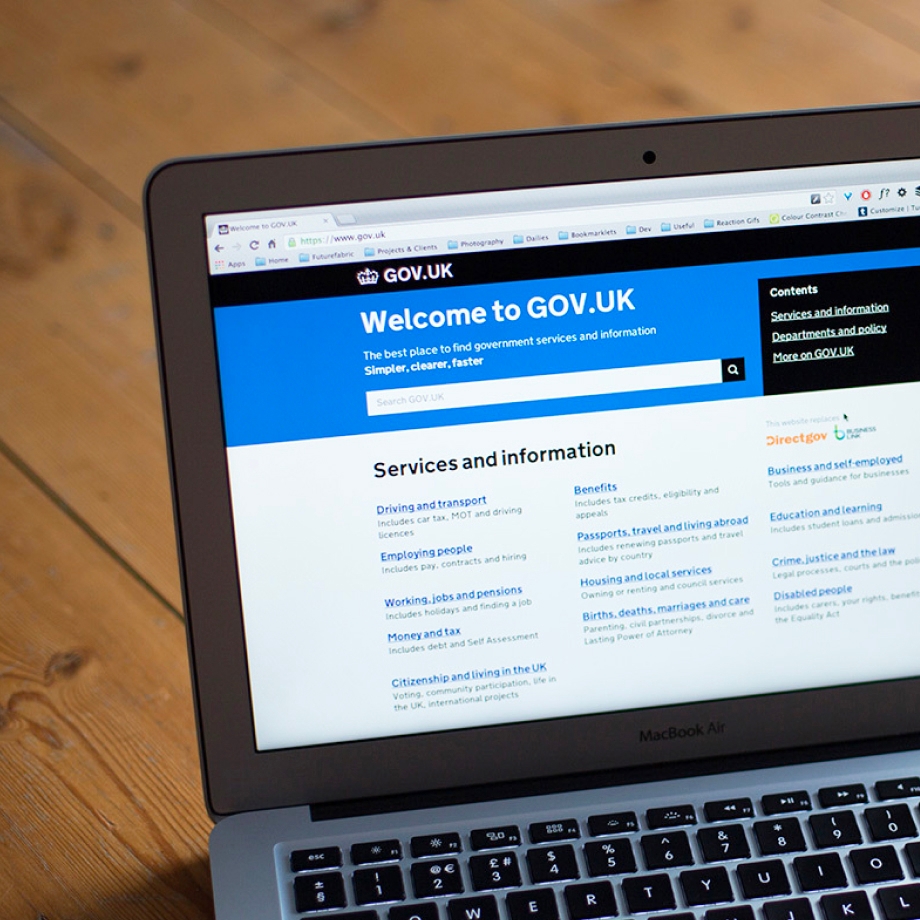
Beta to Live
My work centred on what we referred to internally as ‘mainstream’ – the guidance and services on GOV.UK published in service of the general UK population. This included things like ‘UK bank holidays’↗, ‘Renewing your driving licence’↗ and ‘Running a limited company’↗.
As a small, nascent design team, we designed in service of users’ needs, working collaboratively with content designers, engineers and data analysts. We took GOV.UK live at the end of 2012 and in the process established design formats and patterns that formed the beginnings of a graphic and interaction design language for government.
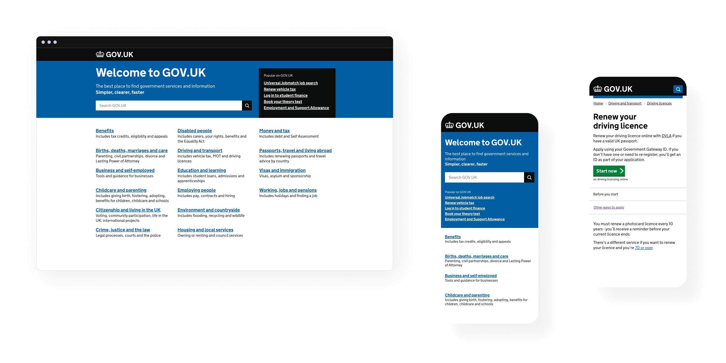
A lot of the design work we did at GDS was very tactical. We designed in an intentionally restrained way. This was a combination of absolute focus on the user to create the most straightforward experience possible and a collective understanding that we needed to be ruthlessly cost-effective to demonstrate GDS was value for money for the taxpayer.
Ultimately, this approach helped establish user-centred design in government and to secure GDS’ future at the time.
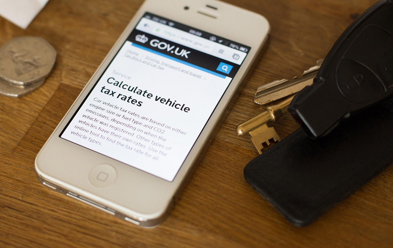
I took a lot of photographs of GOV.UK in context as we didn't really have any to work with. The ones you see on this page I shot with my Canon SLR and shared across GDS for use in presentations and blog posts.
Live and beyond
When GOV.UK went live, the work really began. We now had a userbase of millions giving us a lot of quantitative data to work with. Using this alongside the qualitative work of research teams we could get clear signals to help us with the iteratation of our content and formats.
I designed and prototyped on numerous multidiscipline teams and internal projects. A few memorable ones for me include:
- Service start pages — Design of a format to clearly surface requirements and instructions for users at the start of 100s of service flows.
- Foreign Travel advice — Design of a chaptered format and accessible maps to display FCO travel advice for all countries.
- 2015 Election — Design to help the transition to a new government, giving clear indication of current, canonical publications versus those that had become archived and historical.
Design and illustration
Alongside my work in product design and front-end, I also produced quite a lot of graphics and illustration for GDS, helping in part to establish the overall aesthetic for graphic design and illustration. You can see a small selection of this below.
Mission patches
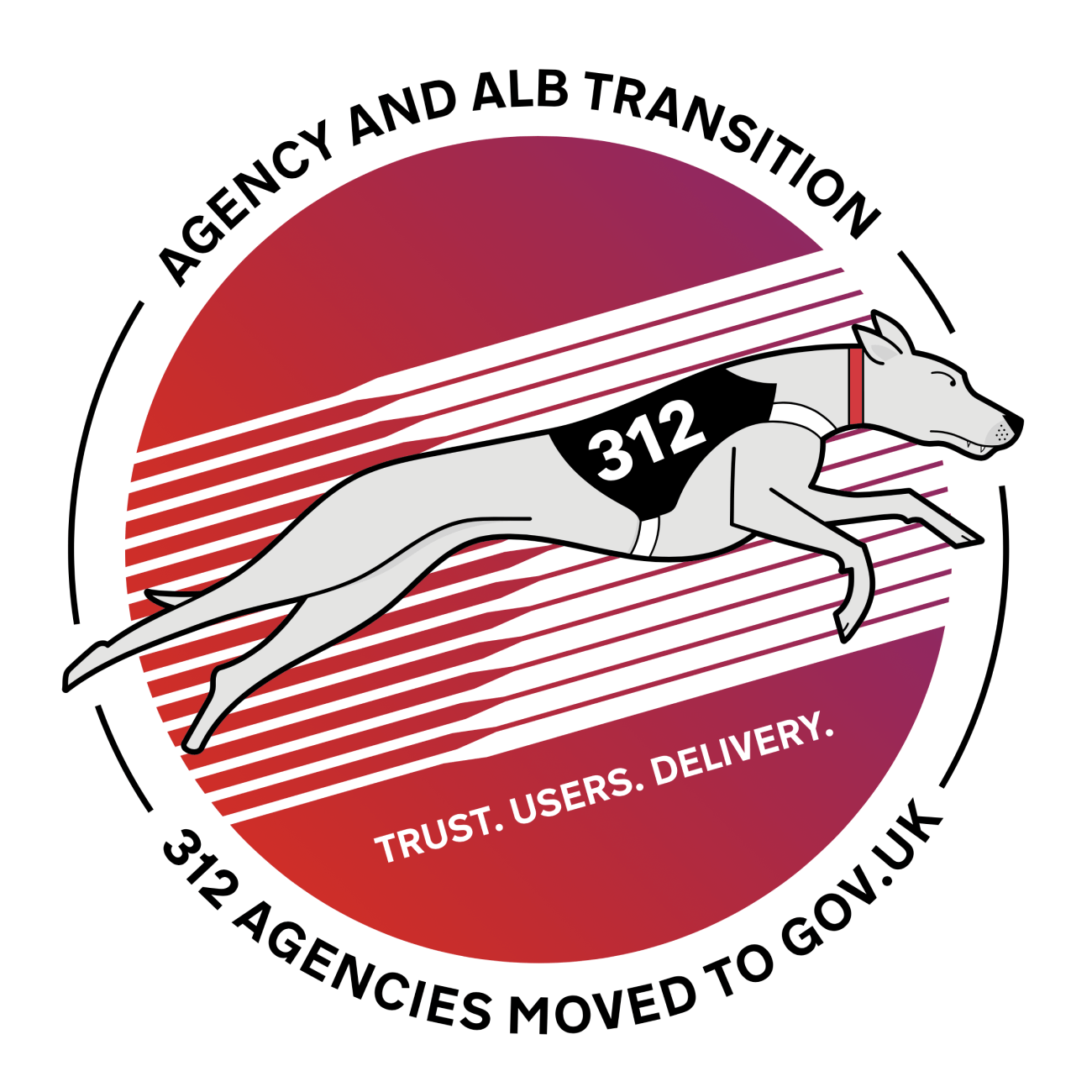
Following NASA’s example we created mission patches to commemorate teams and project delivery. I designed lots of these during my time, a small selection of which can be seen above, including the first ever one, to commemorate the GOV.UK Beta (on the far left).


Symbols and icons
During the Beta phase, the team believed we needed a selection of symbols that could sit alongside page titles to act as a kind of visual shorthand for the different formats we had on GOV.UK. I designed a large selection, some of which can be seen above. The belief here was that symbols could act as a kind of aide memoire and help remind users what type of content they were interacting with, making it easier to understand what to do next.
But in reality, these ended up being something of a solution looking for a problem. We discovered there wasn’t really a need to do this as it doesn’t matter too much to a user what content type they are looking at, provided their need is met. Obvious and easy to see now, but in the very early days we had to experiment in the absence of much user data or research.
It felt kind of poetic at least to be the one to rewrite and push the CSS to retire them.
Awards & Recognition
The creation of GOV.UK was a landmark moment. It felt fitting that it picked up some notable awards, including the Design Museum’s Design of the Year and Black and Yellow pencils from D&AD.
Credits
I worked at GDS from 2012–2015. During this time GOV.UK was designed in collaboration across multiple agile teams. Designers included Mark Hurrell, Henry Hadlow, James Weiner, Josh Marshall, Amy Whitney, Stephen McCarthy, Chris Heathcote, Ed Horsford, Rebecca Cottrell, Tim Paul, Paul Annett, and Michael Thomas.
I also collaborated closely on the front-end with engineers, Frances Berriman and Edd Sowden.
Design direction from Ben Terrett and Russell Davies. Content design direction from Sarah Winters.

